Packaging — 2025Sample project
Okra & Oak
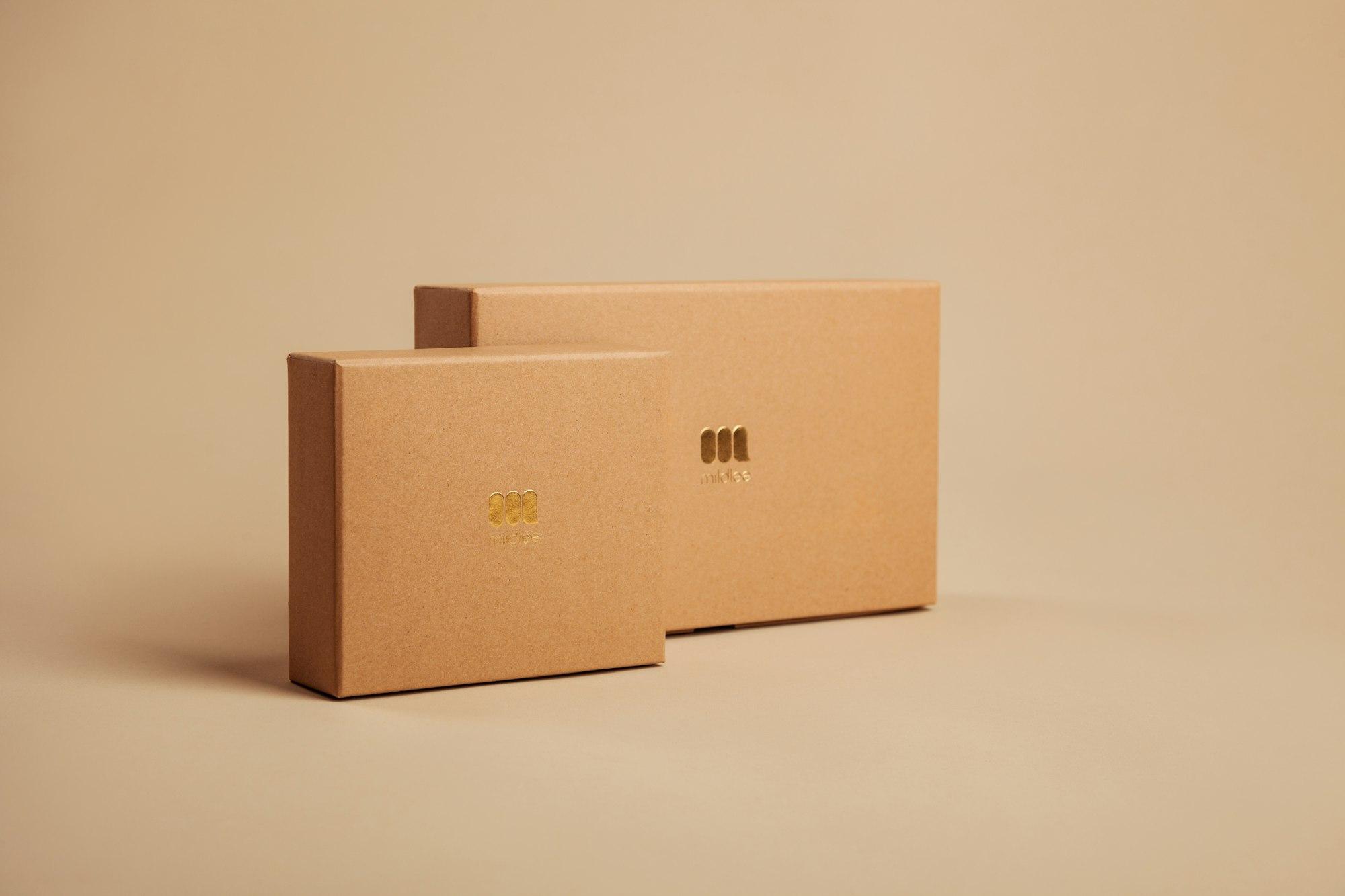
Packaging for a tea and spice range where every tin wears its own colour.
- Discipline
- Packaging
- Year
- 2025
- Services
- Packaging design, Labels, Colour system, Print production
- Client
- Sample brand
The brief
Okra & Oak sells single-origin teas and spice blends. Their tins all looked alike, so customers reached for the wrong one.
The approach
Each blend gets a colour drawn from its ingredient, while a shared label band, serif name and numbered system tie the range together on the shelf.
The outcome
A range that reads as one family from across the shop and as individual blends up close, with templates ready for new flavours.